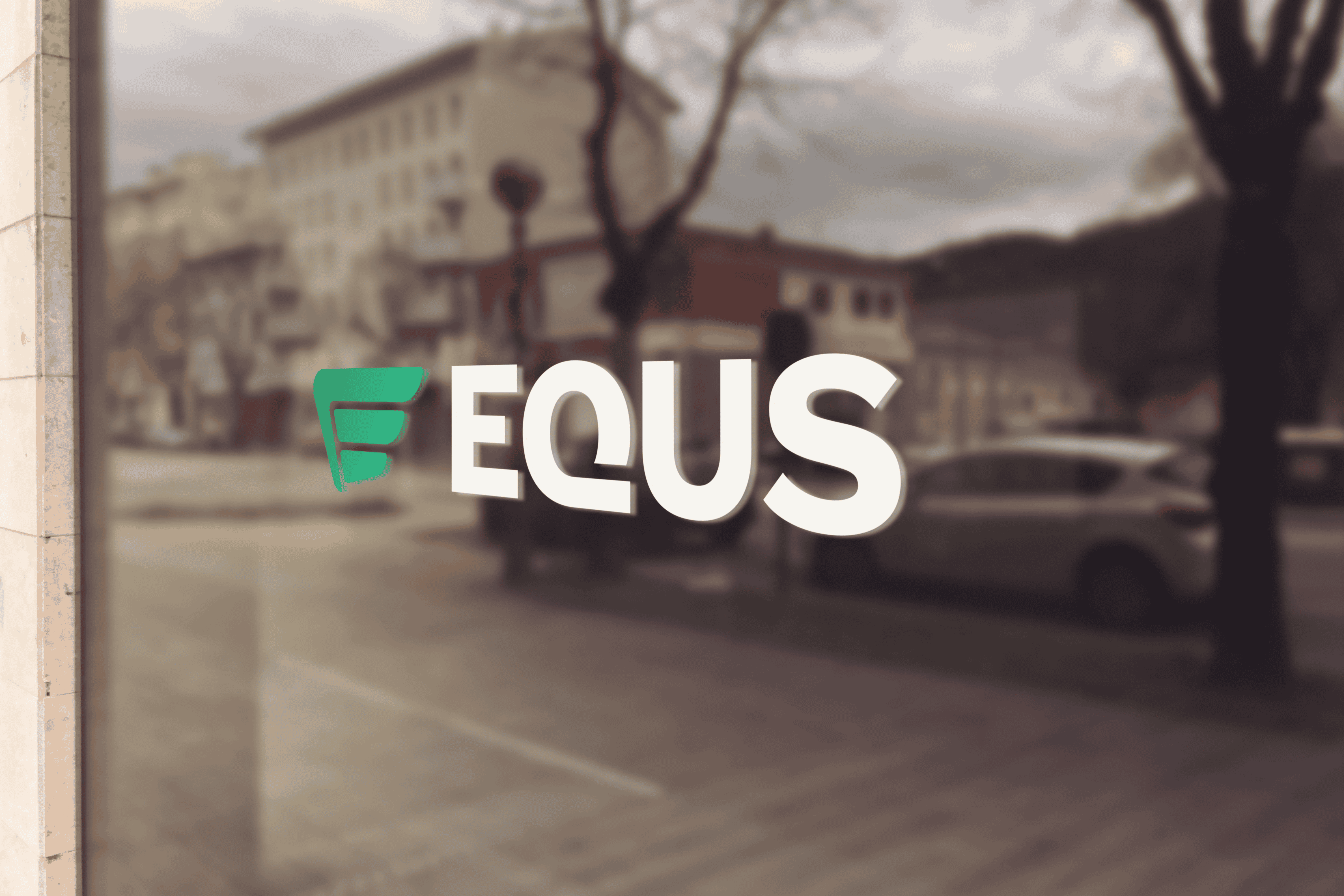
Logo & Brand Identity
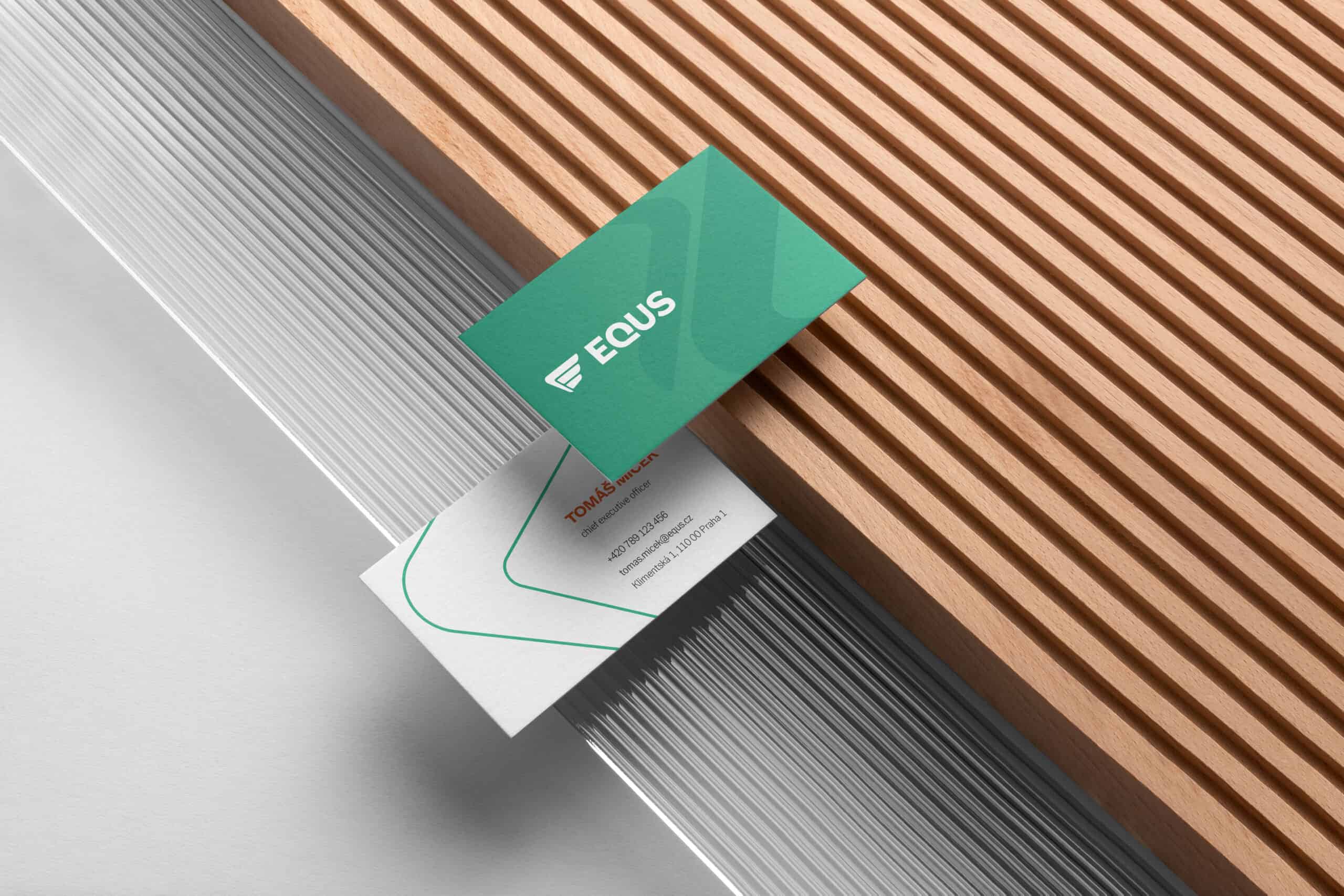
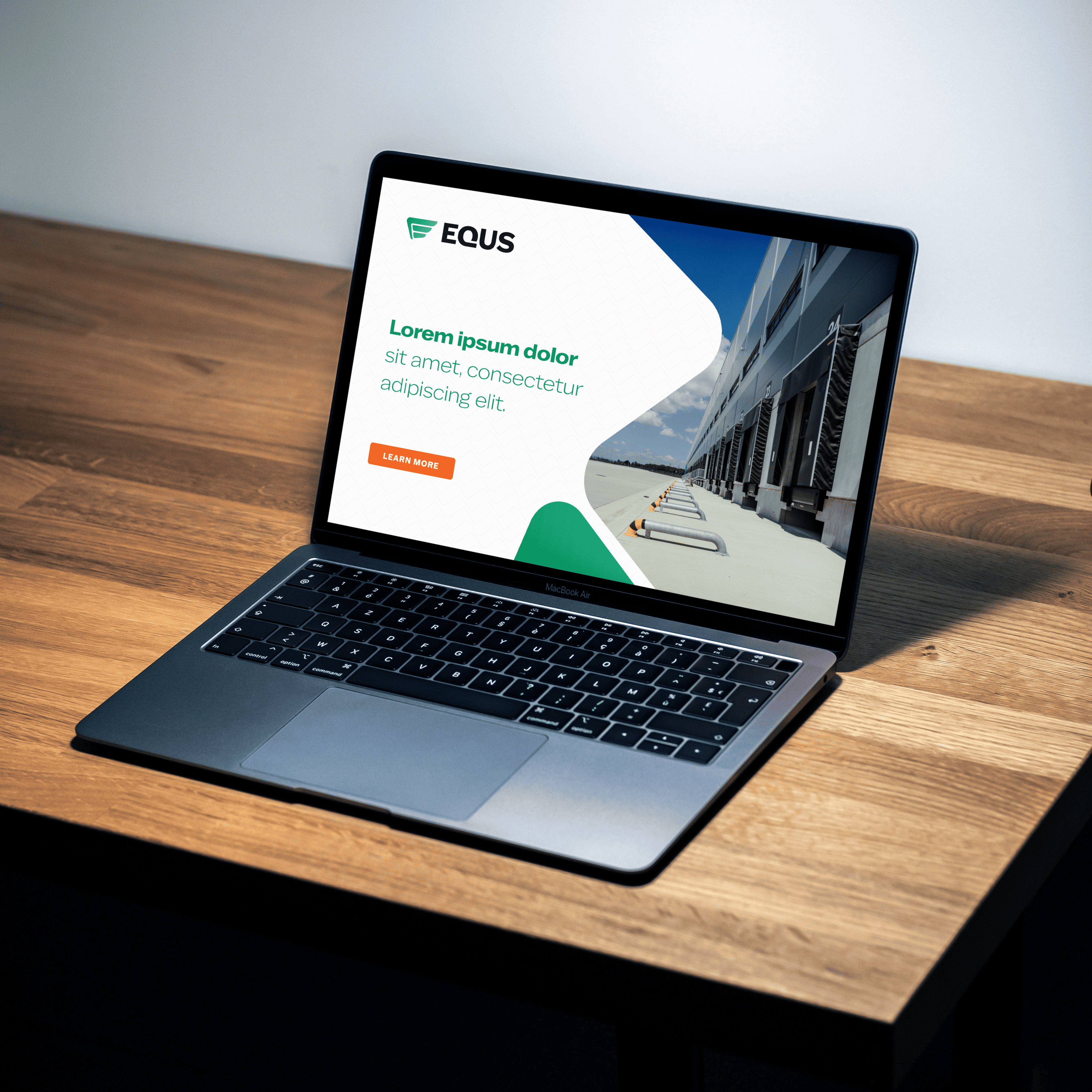
Business card and web design
Name and trademark
Font
We have chosen a sans serif font Latino Gothic Variable for the texts. This variable font allows you to change the width and thickness of the font in any way, and thus, it works well in a variety of situations and uses cases. The same style will be used on the business card, in the online environment, and in the building navigation system.
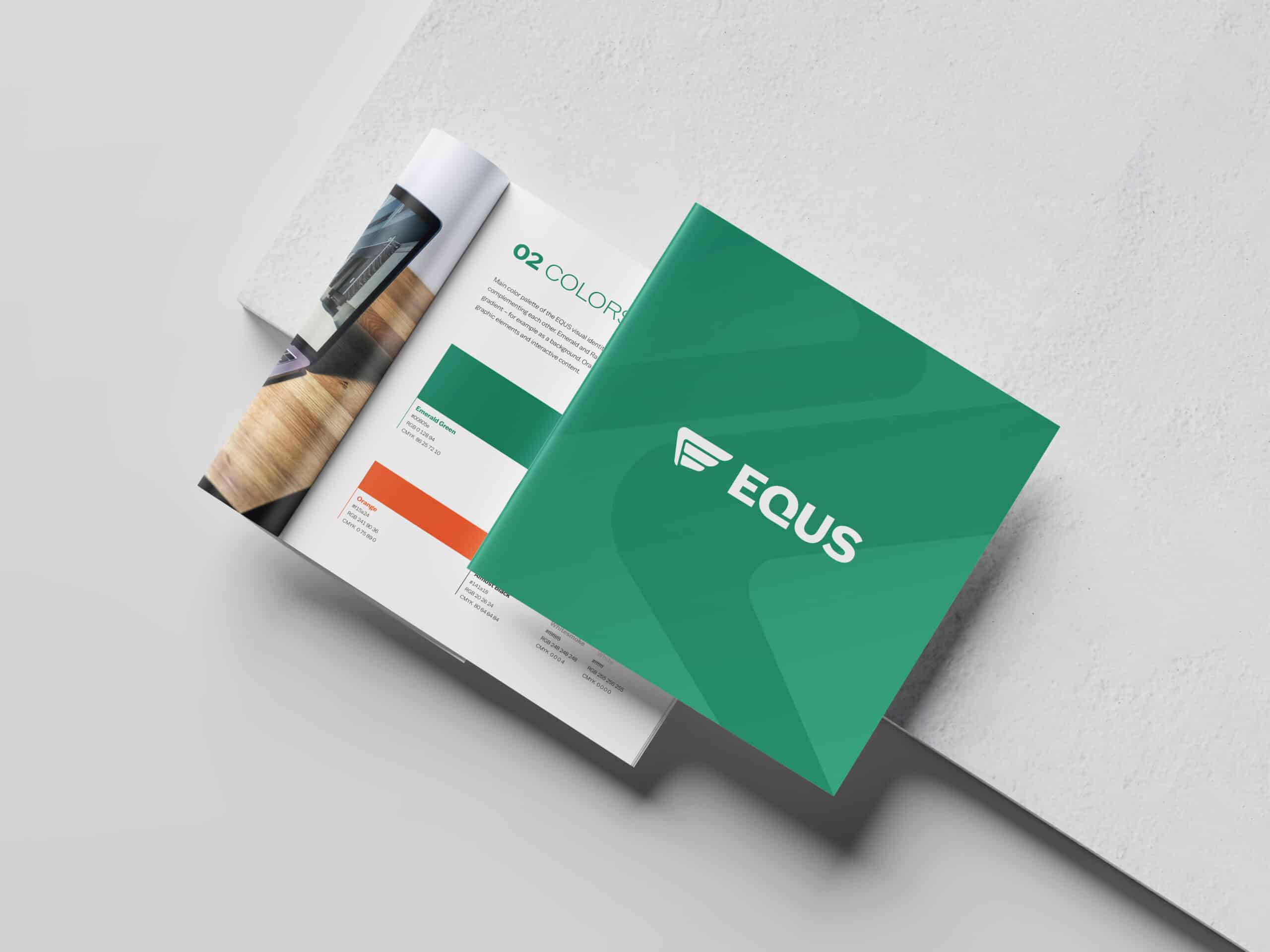
Colors and graphic elements
The fundamental graphic element became a curved shape derived from the EQUS logo. The use of its cut-out creates a shape meant to evoke a road, an element closely related to logistics halls. Using the same element repeatedly, we created a pattern that looks like a tiled roof.
Graphic manual
We materialized all these principles into a comprehensive graphic manual. In addition to the logo and graphic elements, it also contains rules on how to work with them and, conversely, examples of prohibited uses. To show a real example, we have also created a design for the business cards and the website’s homepage.