Logo and visual identity
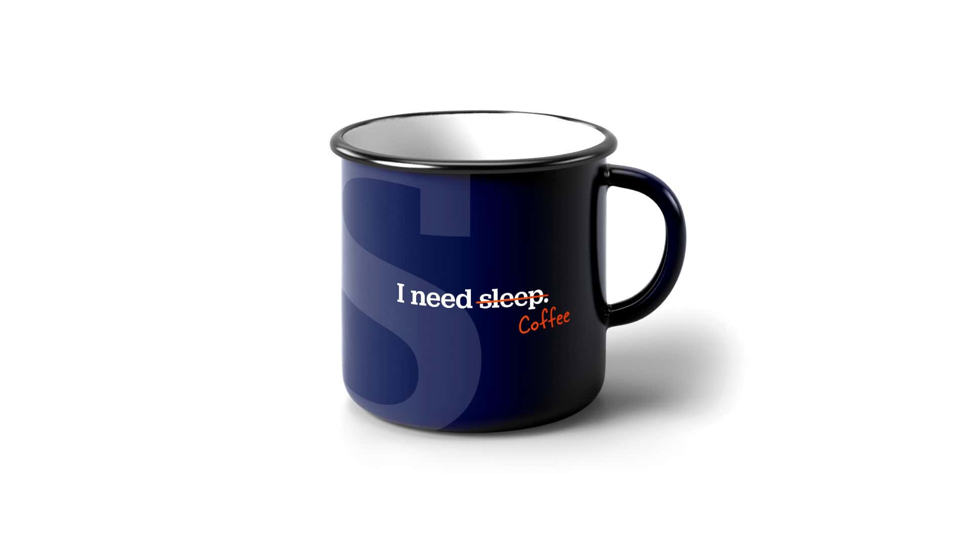
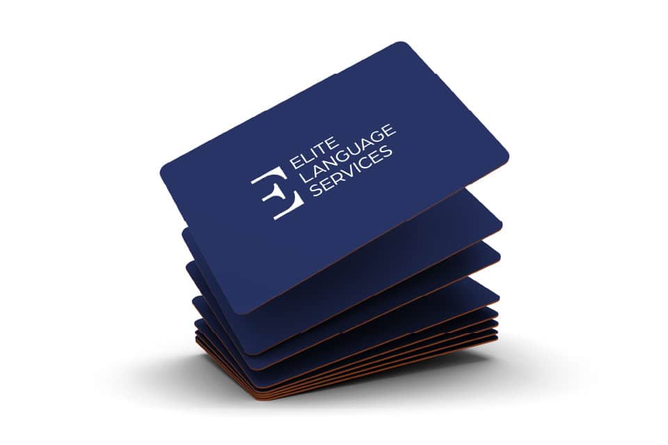
Mock-ups

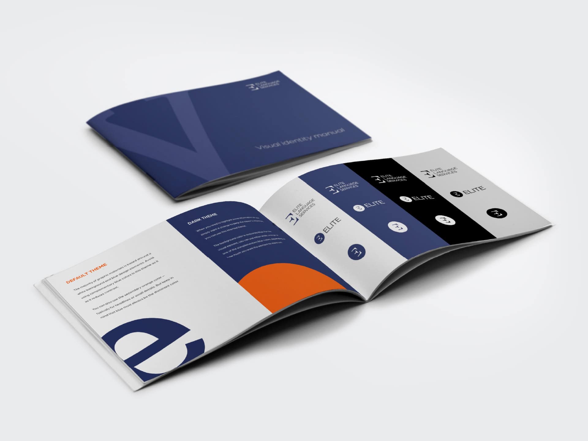
Elaborate logo manual

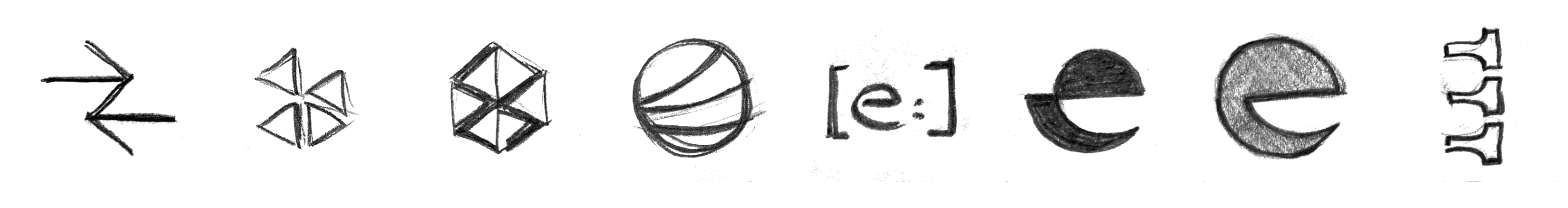
New logo as a symbol of change

The original logo, which was shaped like a book, was unsuitable in shape or design and referred more to Elite’s past focus as a language school. It was necessary to find a new symbol that represented the Elite’s broader values while working across all sizes and uses. The newly designed logo takes inspiration from writing as the basic building block of language. The simple shape and thin lines are both elegant and memorable.

Varianty, které nakonec neprošly

Writing is a beautiful creative activity. So much so that you can build an entire visual around it.

For Elite’s overall graphic style, we decided to build on the principles introduced in the logo and develop them a little further and in more detail. It’s all about the typeface. Especially in the footer typeface, you can find really beautiful shapes. Their variety has allowed us to give each material a unique face closely related to the content itself. And the content is what Elite is all about.

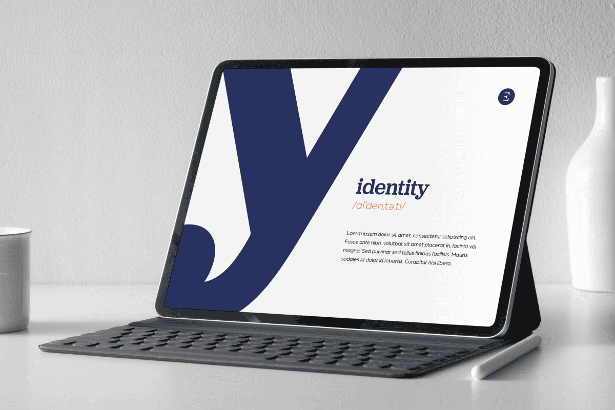
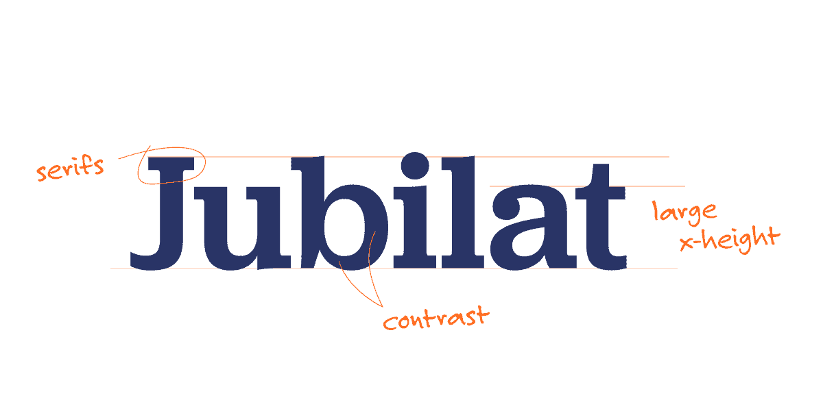
Even a footer font can look modern.

We usually perceive heel fonts as traditional and conservative. By using a footer font for the Elite identity, we wanted to acknowledge this tradition and history, but we also needed a distinctive and modern “look.” We chose Jubilat, which was an excellent choice for the headlines. For smaller texts, we added the geometric, patchless Jost font.

A visual identity designed to be flexible enough to work in any situation

At Elite Language Services, they create a lot of materials, and our goal was to ensure that the new identity made their lives as easy as possible. We designed the logo in different sizes and color variations. By using characters as graphic elements, graphic designers have dozens of graphic elements to choose from and use at will. Add light and dark variant visuals, orange contrasting elements, and photos… Yet everything holds together, and the result is still “Elite.”